library(palmerpenguins)
library(ggplot2)
library(shiny)
library(bslib)


#################
### Define UI ###
#################

ui <- page_sidebar(
  title = h1("Penguins dashboard"),

  # Define sidebar inputs
  sidebar = sidebar(
    title = strong("Plot controls"),

    #create dropdown selection for var on x-axis
    varSelectInput(
      inputId = "var_x",
      label = "Select x-axis",
      data = penguins,
      selected = "bill_length_mm"
    ),

    #create dropdown selection for var on y-axis
    varSelectInput(
      inputId = "var_y",
      label = "Select y-axis",
      data = penguins,
      selected = "body_mass_g"
    ),

    # Add image w/ hyperlink
    a(href = "https://pallter.marine.rutgers.edu",  #add hyperlink
      img(src = "Palmer_LTER_logo.png",  #add image from local directory (in www/ folder)
          width = "80%",
          style = "display: block; margin-left: auto; margin-right: auto;")  #to align image to center
    )

  ),

  ### Main panel content ###

  navset_tab(
    # Page for Adelie
    nav_panel(title = "Adelie",
              h3("Exploration of Adelie data"),
              plotOutput("adelie_plot")
    ),
    # Page for Chinstrap
    nav_panel(title = "Chinstrap",
              h3("Exploration of Chinstrap data"),
              plotOutput("chinstrap_plot")
    ),
    # Page for Gentoo
    nav_panel(title = "Gentoo",
              h3("Exploration of Gentoo data"),
              plotOutput("gentoo_plot")
    ),
    nav_spacer(),  #shift tabs to be right-aligned
    nav_menu(
      title = "Links",
      nav_item(a(shiny::icon('kiwi-bird'), "palmerpenguins", href = "https://allisonhorst.github.io/palmerpenguins/")),
      nav_item(a(shiny::icon("globe"), "Palmer LTER", href = "https://pallter.marine.rutgers.edu"))
    )
  )

)


#####################
### Define server ###
#####################

server <- function(input, output, session) {

  # Create biplots based on selected variables
  output$adelie_plot <- renderPlot({
    ggplot(penguins[penguins$species == 'Adelie',]) +
      geom_point(aes(!!input$var_x, !!input$var_y), color = "cadetblue", size = 4, alpha = 0.75) +
      theme_bw(base_size = 20)
  })

  output$chinstrap_plot <- renderPlot({
    ggplot(penguins[penguins$species == 'Chinstrap',]) +
      geom_point(aes(!!input$var_x, !!input$var_y), color = "goldenrod", size = 4, alpha = 0.75) +
      theme_bw(base_size = 20)
  })

  output$gentoo_plot <- renderPlot({
    ggplot(penguins[penguins$species == 'Gentoo',]) +
      geom_point(aes(!!input$var_x, !!input$var_y), color = "firebrick", size = 4, alpha = 0.75) +
      theme_bw(base_size = 20)
  })

}


###############
### Run app ###
###############

shinyApp(ui, server)6 Shiny app layouts
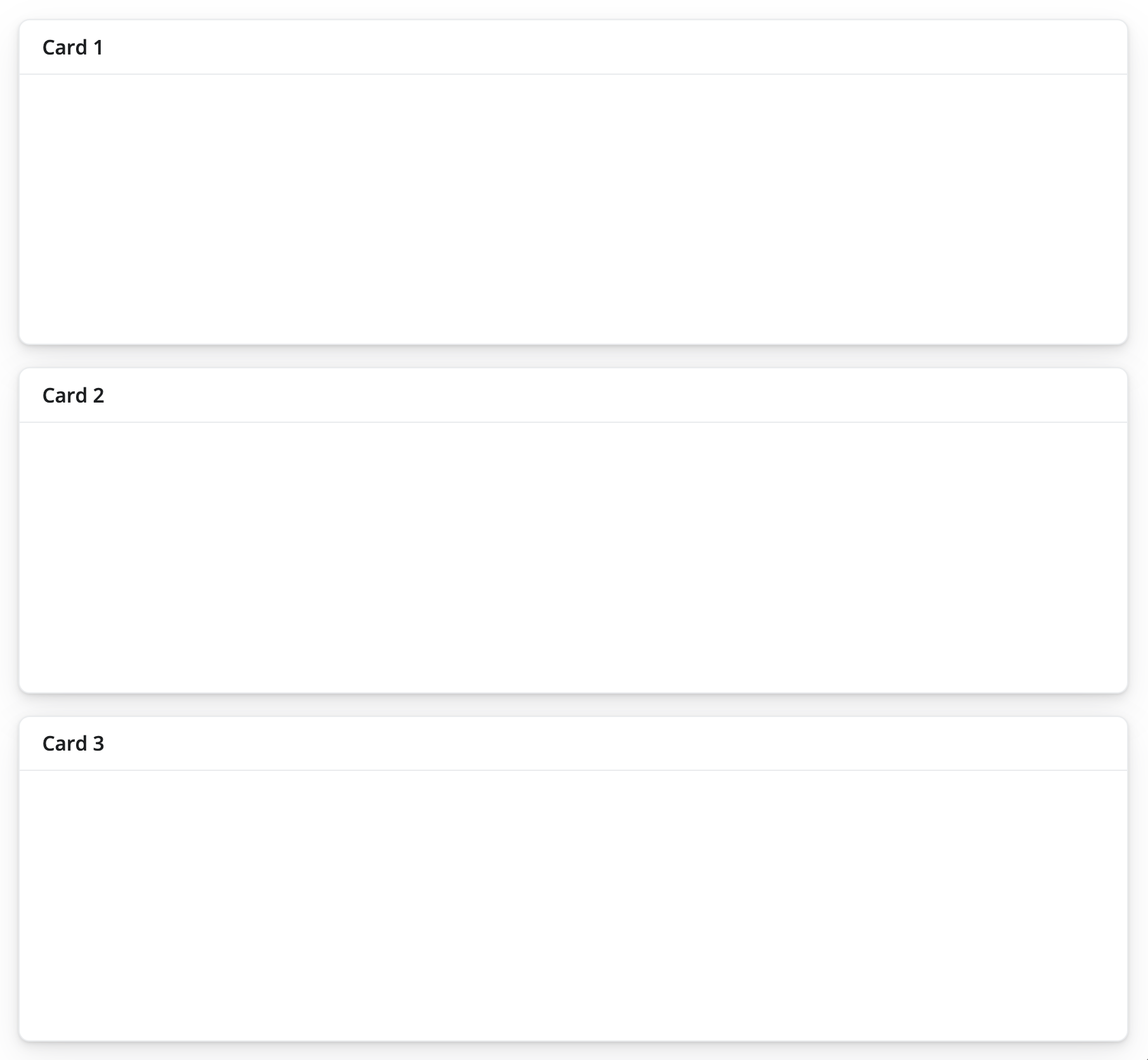
At its simplest, a Shiny app can be constructed from an empty box/container that stores all of the inputs and outputs. These will be placed in order from top to bottom of the window depending on how much space each component takes up. Below are examples from a Shiny for R article on formatting layouts, where one example shows components added by row whereas the other is oriented as columns.

The main factor to consider when defining layouts for Shiny apps is that each row is comprised of 12 columns of equal width. So whenever a component is added that exceeds a value of 12 when including the preceding components, it is move to the next row down. The below diagram shows a nice example of how these are constructed.
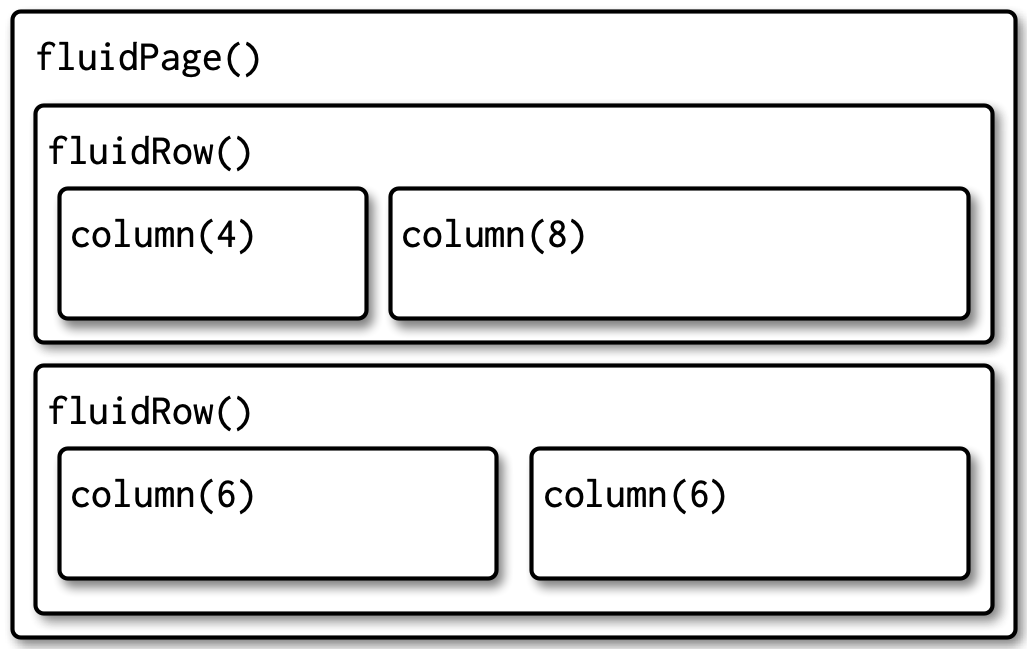
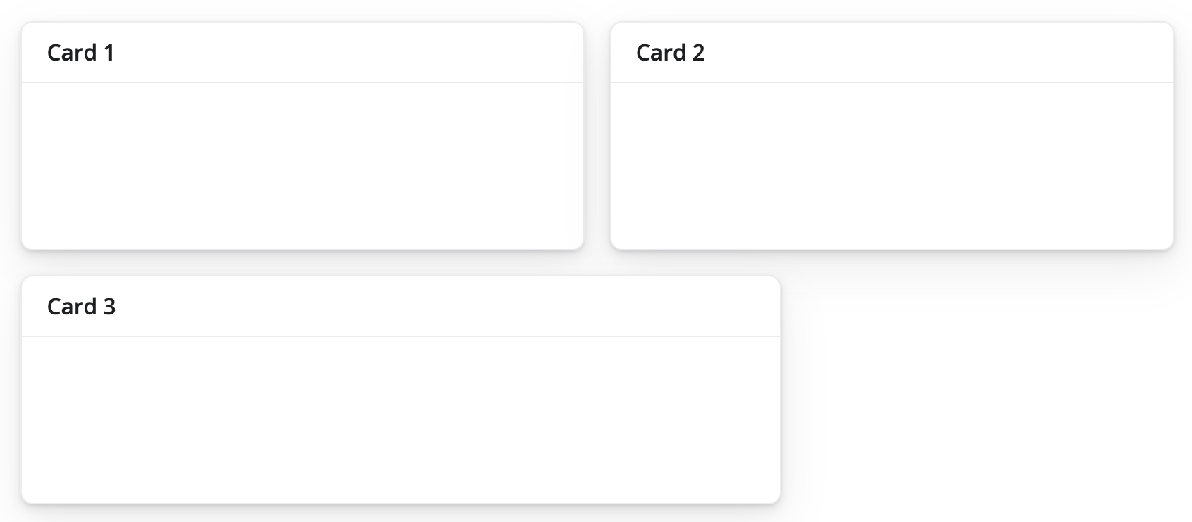
In each of these rows, we see that the total column width sums to 12. However, components will wrap around to the next row if they exceed 12 in total, as shown in the example below.
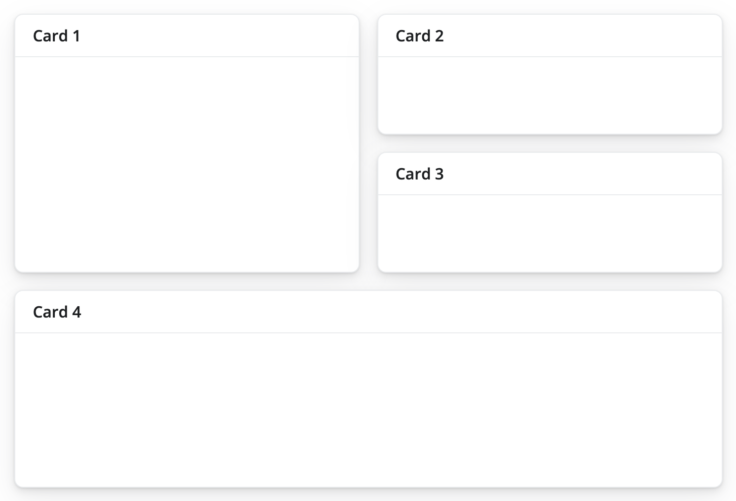
When constructed thoughtfully, apps can be customized into more complex layouts that include nested rows and columns like the example shown below.
Beyond the simple fillable layout, some of the common layouts that have more structure include sidebar layouts and multi-page layouts. Sidebar layouts are often used to physically partition text and input widgets from visualizations. Multi-page layouts separate content across multiple pages, which is useful when there are many visualizations to include, text-based descriptions of the app or underlying data, as well as separating out different pieces of a workflow. Example diagrams of each can be seen below.
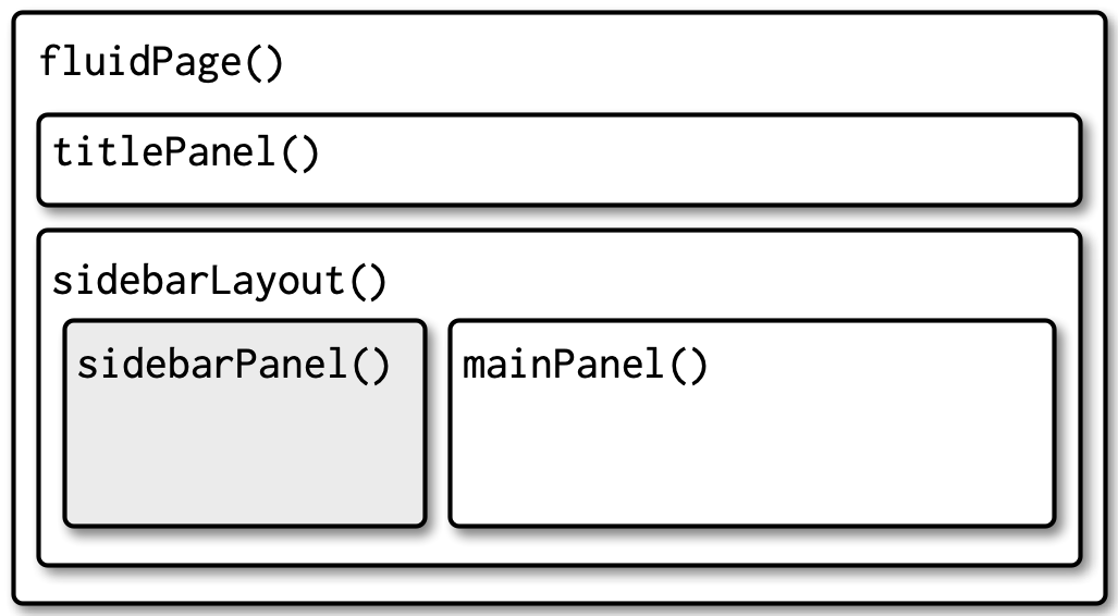

bslib
For more information on designing Shiny UI layouts, refer to Mastering Shiny and {bslib}. To learn more about designing UI layouts via a user-friendly interface, look into using ShinyUiEditor.
Exercise 1
Using the included code:
- Change the layout to a navbar page
- Reverse the order of the species listed in the navbar
library(palmerpenguins)
library(ggplot2)
library(shiny)
library(bslib)


#################
### Define UI ###
#################

ui <- page_navbar(
  title = h1("Penguins dashboard"),

  # Define sidebar inputs
  sidebar = sidebar(
    title = strong("Plot controls"),

    #create dropdown selection for var on x-axis
    varSelectInput(
      inputId = "var_x",
      label = "Select x-axis",
      data = penguins,
      selected = "bill_length_mm"
    ),

    #create dropdown selection for var on y-axis
    varSelectInput(
      inputId = "var_y",
      label = "Select y-axis",
      data = penguins,
      selected = "body_mass_g"
    ),

    # Add image w/ hyperlink
    a(href = "https://pallter.marine.rutgers.edu",  #add hyperlink
      img(src = "Palmer_LTER_logo.png",  #add image from local directory (in www/ folder)
          width = "80%",
          style = "display: block; margin-left: auto; margin-right: auto;")  #to align image to center
    )

  ),

  ### Main panel content ###

  # Page for Gentoo
  nav_panel(title = "Gentoo",
            h3("Exploration of Gentoo data"),
            plotOutput("gentoo_plot")
  ),
  # Page for Chinstrap
  nav_panel(title = "Chinstrap",
            h3("Exploration of Chinstrap data"),
            plotOutput("chinstrap_plot")
  ),
  # Page for Adelie
  nav_panel(title = "Adelie",
            h3("Exploration of Adelie data"),
            plotOutput("adelie_plot")
  ),
    nav_spacer(),  #shift tabs to be right-aligned
    nav_menu(
      title = "Links",
      nav_item(a(shiny::icon('kiwi-bird'), "palmerpenguins", href = "https://allisonhorst.github.io/palmerpenguins/")),
      nav_item(a(shiny::icon("globe"), "Palmer LTER", href = "https://pallter.marine.rutgers.edu"))
    )
  )


#####################
### Define server ###
#####################

server <- function(input, output, session) {

  # Create biplots based on selected variables
  output$adelie_plot <- renderPlot({
    ggplot(penguins[penguins$species == 'Adelie',]) +
      geom_point(aes(!!input$var_x, !!input$var_y), color = "cadetblue", size = 4, alpha = 0.75) +
      theme_bw(base_size = 20)
  })

  output$chinstrap_plot <- renderPlot({
    ggplot(penguins[penguins$species == 'Chinstrap',]) +
      geom_point(aes(!!input$var_x, !!input$var_y), color = "goldenrod", size = 4, alpha = 0.75) +
      theme_bw(base_size = 20)
  })

  output$gentoo_plot <- renderPlot({
    ggplot(penguins[penguins$species == 'Gentoo',]) +
      geom_point(aes(!!input$var_x, !!input$var_y), color = "firebrick", size = 4, alpha = 0.75) +
      theme_bw(base_size = 20)
  })

}


###############
### Run app ###
###############

shinyApp(ui, server)
Exercise 2
library(palmerpenguins)
library(ggplot2)
library(shiny)
library(bslib)


#################
### Define UI ###
#################

ui <- page_fillable(
  h1("Penguins dashboard"),

  ### Input widgets ###

  #create dropdown selection for var on x-axis
  layout_columns(
    varSelectInput(
      inputId = "var_x",
      label = "Select x-axis",
      data = penguins,
      selected = "bill_length_mm"
    ),

    #create dropdown selection for var on y-axis
    varSelectInput(
      inputId = "var_y",
      label = "Select y-axis",
      data = penguins,
      selected = "body_mass_g"
    )
  ),

  br(),  #add some white space

  ### Outputs ###
  plotOutput("adelie_plot"),
  plotOutput("chinstrap_plot"),
  plotOutput("gentoo_plot")
)


#####################
### Define server ###
#####################

server <- function(input, output, session) {

  # Create biplots based on selected variables
  output$adelie_plot <- renderPlot({
    ggplot(penguins[penguins$species == 'Adelie',]) +
      geom_point(aes(!!input$var_x, !!input$var_y), color = "cadetblue", size = 4, alpha = 0.75) +
      theme_bw(base_size = 20)
  })

  output$chinstrap_plot <- renderPlot({
    ggplot(penguins[penguins$species == 'Chinstrap',]) +
      geom_point(aes(!!input$var_x, !!input$var_y), color = "goldenrod", size = 4, alpha = 0.75) +
      theme_bw(base_size = 20)
  })

  output$gentoo_plot <- renderPlot({
    ggplot(penguins[penguins$species == 'Gentoo',]) +
      geom_point(aes(!!input$var_x, !!input$var_y), color = "firebrick", size = 4, alpha = 0.75) +
      theme_bw(base_size = 20)
  })

}


###############
### Run app ###
###############

shinyApp(ui, server)
Using the included code:
- Add plots to cards that include a) the species name in the header and b) islands occupied in the footer
- Arrange the plots so that the Chinstrap and Gentoo are in the top row (below the dropdown menus) and have equal width, whereas the Adelie plot is on the bottom row and takes up the left two-thirds.
- Add a table of full penguins dataset using functions from
{DT}to the bottom row on the right, taking up the remaining one-third
library(palmerpenguins)
library(tidyverse)
library(shiny)
library(bslib)
library(DT)


# Determine islands occupied by each species
spp_islands <- penguins |>
  split(~species) |>
  map(~unique(.x$island) |>
        sort())


#################
### Define UI ###
#################

ui <- page_fillable(
  h1("Penguins dashboard"),

  ### Input widgets ###

  #create dropdown selection for var on x-axis
  layout_columns(
    col_widths = c(6, 6,
                   12,
                   6, 6,
                   8, 4),

    varSelectInput(
      inputId = "var_x",
      label = "Select x-axis",
      data = penguins,
      selected = "bill_length_mm"
    ),

    #create dropdown selection for var on y-axis
    varSelectInput(
      inputId = "var_y",
      label = "Select y-axis",
      data = penguins,
      selected = "body_mass_g"
    ),

    br(),  #add some white space

    ### Outputs ###
    card(
      card_header("Chinstrap"),
      plotOutput("chinstrap_plot"),
      card_footer(paste("Occupies", paste(spp_islands$Chinstrap, collapse = ", ")))
    ),
    card(
      card_header("Gentoo"),
      plotOutput("gentoo_plot"),
      card_footer(paste("Occupies", paste(spp_islands$Gentoo, collapse = ", ")))
    ),
    card(
      card_header("Adelie"),
      plotOutput("adelie_plot"),
      card_footer(paste("Occupies", paste(spp_islands$Adelie, collapse = ", ")))
    ),
    card(
      DT::dataTableOutput("tbl"),
      full_screen = TRUE
    )
  )
)


#####################
### Define server ###
#####################

server <- function(input, output, session) {

  # Create biplots based on selected variables
  output$adelie_plot <- renderPlot({
    ggplot(penguins[penguins$species == 'Adelie',]) +
      geom_point(aes(!!input$var_x, !!input$var_y), color = "cadetblue", size = 4, alpha = 0.75) +
      theme_bw(base_size = 20)
  })

  output$chinstrap_plot <- renderPlot({
    ggplot(penguins[penguins$species == 'Chinstrap',]) +
      geom_point(aes(!!input$var_x, !!input$var_y), color = "goldenrod", size = 4, alpha = 0.75) +
      theme_bw(base_size = 20)
  })

  output$gentoo_plot <- renderPlot({
    ggplot(penguins[penguins$species == 'Gentoo',]) +
      geom_point(aes(!!input$var_x, !!input$var_y), color = "firebrick", size = 4, alpha = 0.75) +
      theme_bw(base_size = 20)
  })


  # Create table show all penguins data
  output$tbl <- DT::renderDataTable({
    penguins
  })

}


###############
### Run app ###
###############

shinyApp(ui, server)