library(palmerpenguins)
library(tidyverse)
library(shiny)
library(bslib)
library(bsicons)
library(RColorBrewer)


#################
### Define UI ###
#################

ui <- page_sidebar(
  title = h1("Penguins dashboard"),

  # Define sidebar inputs
  sidebar = sidebar(
    title = strong("Plot controls"),

    # Controls for both plots
    selectizeInput(inputId = "spp",
                   label = "Select a species",
                   choices = unique(penguins$species),
                   selected = "Adelie",
                   multiple = TRUE
    ),

    popover(
      bsicons::bs_icon("gear", title = "Color Palette"),
      title = "Set color palette",
      selectInput("pal",
                  "RColorBrewer",
                  selected = "Set1",
                  choices = RColorBrewer::brewer.pal.info |>
                    filter(category == 'qual') |>
                    rownames(),
                  multiple = FALSE)
    ),


    #create dropdown selection for var on x-axis
    varSelectInput(
      inputId = "var_x",
      label = "Select x-axis",
      data = penguins,
      selected = "bill_length_mm"
    ),

    #create dropdown selection for var on y-axis
    varSelectInput(
      inputId = "var_y",
      label = "Select y-axis",
      data = penguins,
      selected = "body_mass_g"
    ),


    # Add reactive text that summarizes 'species' selection
    htmlOutput("txt")

  ),

  # Main panel content
  layout_columns(
    value_box(title = "Total sample size",
              value = nrow(penguins),
              showcase = icon('kiwi-bird'),
              theme = "bg-gradient-indigo-purple"),

    value_box(title = "Islands sampled",
              value = n_distinct(penguins$island),
              showcase = bsicons::bs_icon('geo-alt-fill'),
              theme = "bg-gradient-orange-green"),

    value_box(title = "Latest sampling year",
              value = max(penguins$year),
              showcase = icon('calendar'),
              theme = "bg-gradient-yellow-red")
  ),


  h3("Exploration of Palmer penguins data"),

  plotOutput("biplot")

)


#####################
### Define server ###
#####################

server <- function(input, output, session) {

  ### Modal dialog ###

  # Generate modal dialog text and set options
  dialog_text <- modalDialog(
    title = strong("Disclaimer"),
    easy_close = TRUE,
    p("Data were collected and made available by Dr. Kristen Gorman and the Palmer Station, Antarctica LTER, a member of the Long Term Ecological Research Network."),

    p("The", code("{palmerpenguins}"), "package contains two datasets. Both datasets contain data for 344 penguins. There are 3 different species of penguins in this dataset, collected from 3 islands in the Palmer Archipelago, Antarctica. More info can be found at this link:"),

    # Link to {palmerpenguins} package website
    a("{palmerpenguins}", href = "https://allisonhorst.github.io/palmerpenguins/")
  )


  # Set modal dialog box to appear when app is initialized
  observe({
    showModal(dialog_text)
  })


  # Create reactive object for filtered penguins data
  penguins_filt <- reactive({
    penguins |>
      filter(species %in% input$spp)
  })


  ### Notification based on species filtering ###
  observe({
    req(penguins_filt())

    showNotification(
      HTML(paste("The species input has changed.", br(), "This message will disappear after 5 seconds.")),
      type = "message",
      duration = 5  #lasts 5 seconds
    )
  })


  ### Output in app ###

  # Generate text for sidebar based on penguins_filt
  output$txt <- renderText({
    paste(strong(n_distinct(penguins_filt()$species)),  #bold reactive component
          "species were selected, which includes",
          strong(paste(unique(penguins_filt()$species), collapse = ", "))  #bold reactive component
    )
  })

  # Create biplot based on selected variables
  output$biplot <- renderPlot({
    ggplot(penguins_filt()) +
      geom_point(aes(!!input$var_x, !!input$var_y, color = species), size = 2, alpha = 0.75) +
      scale_color_brewer(palette = input$pal) +
      theme_bw(base_size = 20)
  })


}


###############
### Run app ###
###############

shinyApp(ui, server)5 Outputs
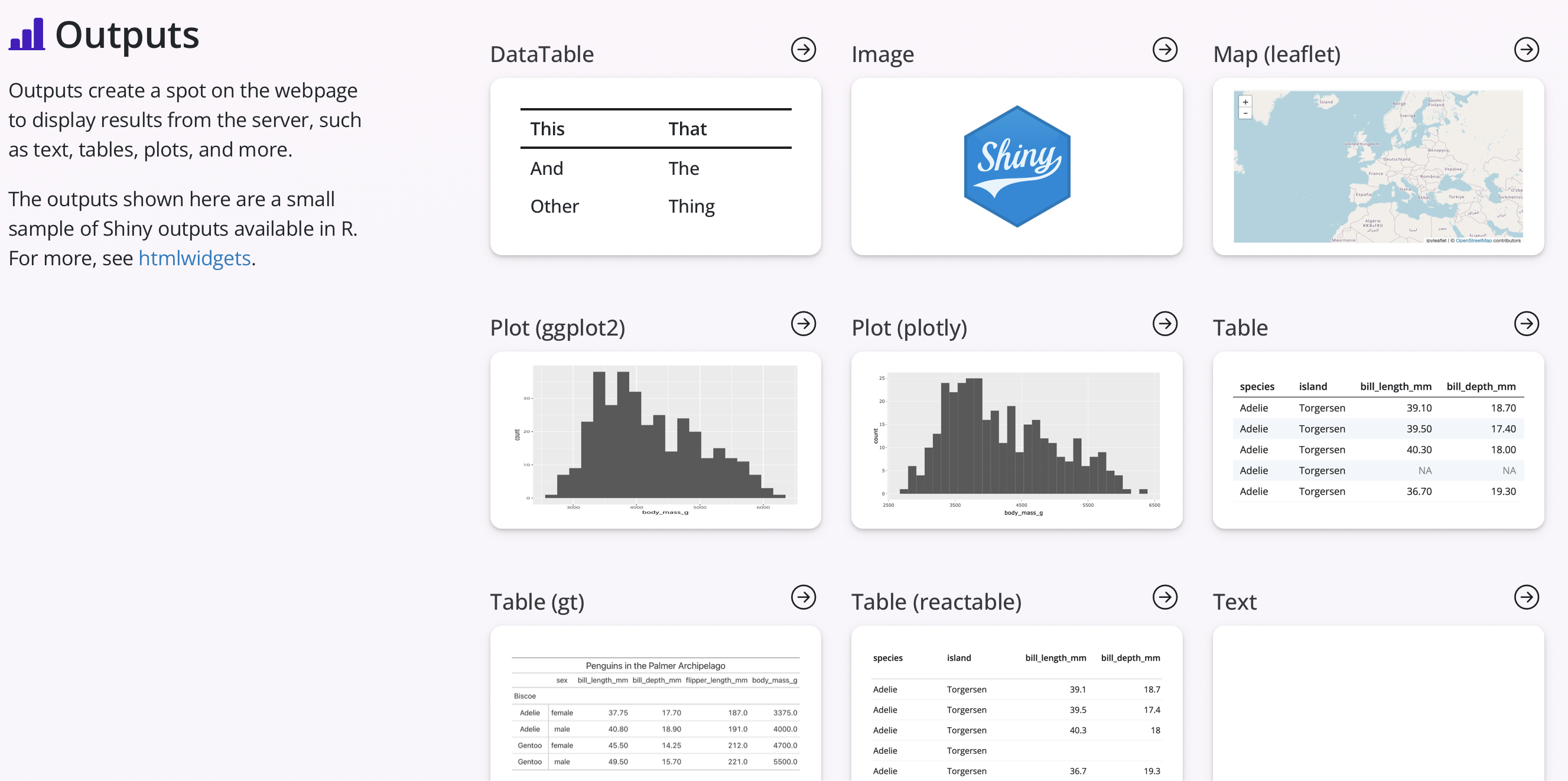
As with the inputs, there are a number of different outputs that can be included in Shiny apps to visualize different types of data. Some of these outputs include static and interactive versions of plots, maps, and tables. Additionally, other outputs can include text, images, value boxes, and even reactive UI components. An example of these outputs can be seen in the screenshot below.
These outputs are typically specified in the server side of the code by using an R function that begins as render*(), where the * would be replaced by ‘Plot’ for a simple plot or ‘Table’ for a simple table. If using interactive table and maps, each of these separate R packages likely have their own functions for adding input and output components to a Shiny app, such as renderLeaflet() for adding an interactive Leaflet map. Examples of other interactive components that could be added are found at the {htmlwidgets} website.
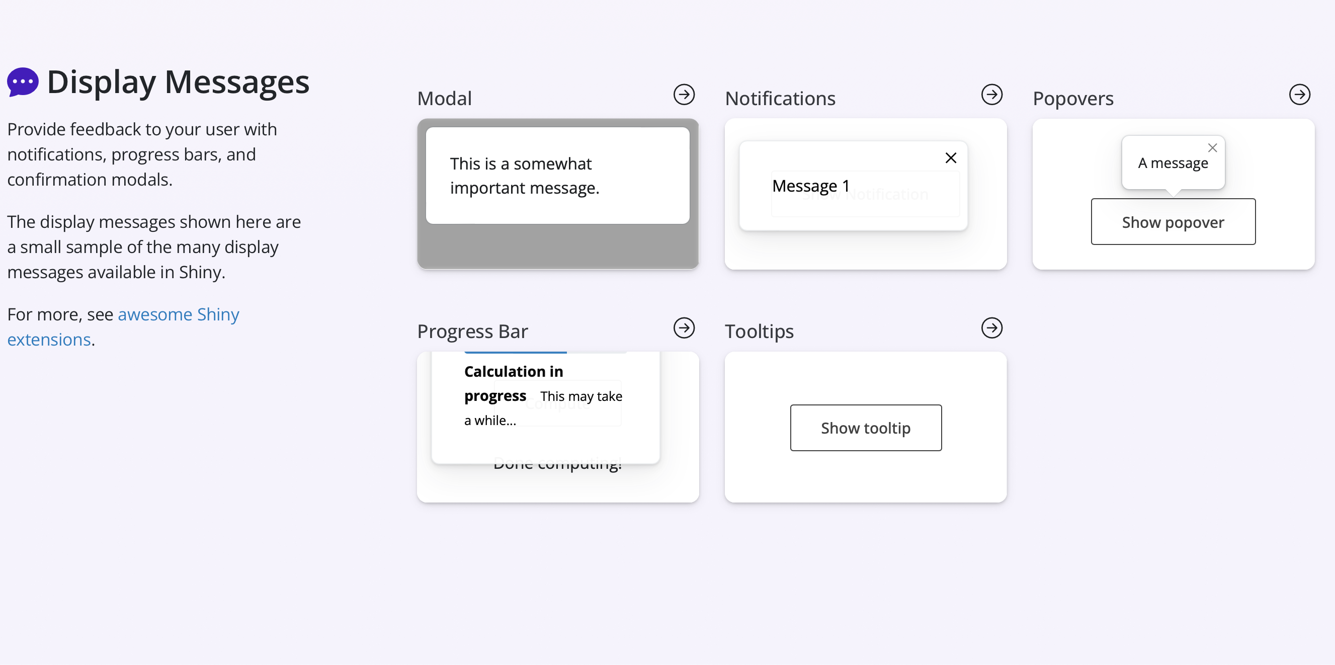
Related to outputs, there are additional Shiny components that include different types of messages such as modal dialog boxes, notifications, progress bars, and popovers. Examples of these can be seen in the screenshot below.
Additional info on Shiny outputs and messages can be found from the Shiny for R tutorial and the Shiny components page.
Exercise 1
Using the included code:
- Change the modal dialog text to be the following disclaimer in italics:
p("Data are available by CC-0 license in accordance with the Palmer Station LTER Data Policy and the LTER Data Access Policy for Type I data."),
p("Anyone interested in publishing the data should contact Dr. Kristen Gorman about analysis and working together on any final products. From Gorman et al. (2014): Individuals interested in using these data are expected to follow the US LTER Network’s Data Access Policy, Requirements and Use Agreement:", a(href="https://lternet.edu/data-access-policy/", "https://lternet.edu/data-access-policy/"), ".")
- Change notification to specify the current variable plotted on the x-axis and change
typeto “warning” from “message”, where the variable name is in bold
library(palmerpenguins)
library(tidyverse)
library(shiny)
library(bslib)
library(bsicons)
library(RColorBrewer)


#################
### Define UI ###
#################

ui <- page_sidebar(
  title = h1("Penguins dashboard"),

  # Define sidebar inputs
  sidebar = sidebar(
    title = strong("Plot controls"),

    # Controls for both plots
    selectizeInput(inputId = "spp",
                   label = "Select a species",
                   choices = unique(penguins$species),
                   selected = "Adelie",
                   multiple = TRUE
    ),

    popover(
      bsicons::bs_icon("gear", title = "Color Palette"),
      title = "Set color palette",
      selectInput("pal",
                  "RColorBrewer",
                  selected = "Set1",
                  choices = RColorBrewer::brewer.pal.info |>
                    filter(category == 'qual') |>
                    rownames(),
                  multiple = FALSE)
    ),


    #create dropdown selection for var on x-axis
    varSelectInput(
      inputId = "var_x",
      label = "Select x-axis",
      data = penguins,
      selected = "bill_length_mm"
    ),

    #create dropdown selection for var on y-axis
    varSelectInput(
      inputId = "var_y",
      label = "Select y-axis",
      data = penguins,
      selected = "body_mass_g"
    ),

    # Add reactive text that summarizes 'species' selection
    htmlOutput("txt")

  ),

  # Main panel content
  layout_columns(
    value_box(title = "Total sample size",
              value = nrow(penguins),
              showcase = icon('kiwi-bird'),
              theme = "bg-gradient-indigo-purple"),

    value_box(title = "Islands sampled",
              value = n_distinct(penguins$island),
              showcase = bsicons::bs_icon('geo-alt-fill'),
              theme = "bg-gradient-orange-green"),

    value_box(title = "Latest sampling year",
              value = max(penguins$year),
              showcase = icon('calendar'),
              theme = "bg-gradient-yellow-red")
  ),


  h3("Exploration of Palmer penguins data"),

  plotOutput("biplot")

)


#####################
### Define server ###
#####################

server <- function(input, output, session) {

  ### Modal dialog ###

  # Generate modal dialog text and set options
  dialog_text <- modalDialog(
    title = strong("Disclaimer"),
    easy_close = TRUE,
    em(
      p("Data are available by CC-0 license in accordance with the Palmer Station LTER Data Policy and the LTER Data Access Policy for Type I data."),

    p("Anyone interested in publishing the data should contact Dr. Kristen Gorman about analysis and working together on any final products. From Gorman et al. (2014): Individuals interested in using these data are expected to follow the US LTER Network’s Data Access Policy, Requirements and Use Agreement:", a(href="https://lternet.edu/data-access-policy/", "https://lternet.edu/data-access-policy/"), ".")
    )
  )


  # Set modal dialog box to appear when app is initialized
  observe({
    showModal(dialog_text)
  })


  # Create reactive object for filtered penguins data
  penguins_filt <- reactive({
    penguins |>
      filter(species %in% input$spp)
  })


  ### Notification based on species filtering ###
  observe({
    req(penguins_filt())

    showNotification(
      HTML(paste("The X-axis has changed to", strong(input$var_x))),
      type = "warning",
      duration = 5  #lasts 5 seconds
    )
  })


  ### Output in app ###

  # Generate text for sidebar based on penguins_filt
  output$txt <- renderText({
    paste(strong(n_distinct(penguins_filt()$species)),  #bold reactive component
          "species were selected, which includes",
          strong(paste(unique(penguins_filt()$species), collapse = ", "))  #bold reactive component
    )
  })

  # Create biplot based on selected variables
  output$biplot <- renderPlot({
    ggplot(penguins_filt()) +
      geom_point(aes(!!input$var_x, !!input$var_y, color = species), size = 2, alpha = 0.75) +
      scale_color_brewer(palette = input$pal) +
      theme_bw(base_size = 20)
  })


}


###############
### Run app ###
###############

shinyApp(ui, server)
